Week Eight, Painting

Today we painted lasted weeks air dry clay sculptures.

IMG_2023

We started by gessoing our sculpture so the paint didn’t mix with the clay because the paint is water based like the clay.

This slideshow requires JavaScript.

I then began to add layers our paint slowly to the clay, Because I was working with 3 smaller works I just stopped and started on the next one. I let each piece dry which game me the upper hand so i didn’t over do each little piece.

my pig like design turned into a cow like animal.


Week Seven, Air Dry Clay

White board
White Board. Riley’s Notes

Todays task was create a sculpture that express your inner creature.

I first started with a few pages of sketches.

I then started. I just playing with the clay in my hands and worked towards my first piece.

This slideshow requires JavaScript.

I worked on this piece probably the longest of the three piece it was so little but it had a lot of detail in it.

This slideshow requires JavaScript.

The second design was more of a cow or a pig. it was a farm animal that was kind of cute and weird.


This slideshow requires JavaScript.

My last design/creature was half animal half monster or maybe it was neither. I have not complete it yet.

I loved working with my hands today. 🙂


Still Life, Week Six

IMG_1965
Before Photoshop
still life
After Photoshop

Today we worked with Still life photography.

In my Still Life represents me in 3 simple yet meaningful items,

  • My journal is over following with heaps of pieces of paper, represents how busy and complex my life can be and how many layers I have.
  • My kindle shows that I still live in the 21st century but I love my quite time and a little bit of romance in my life. I LOVE TO READ.
  • And last but not least my Coffee cup. My Saviour. It helps me with my busy and crazy life.

I loved learning about still life and doing the worksheet about symbolism.

This slideshow requires JavaScript.

I really loved today.  learning about how something it’s so simple and the depth people actually see objects in painting.  There is so detail in such little tings.


Vinyl heat press Week five

img_1078
Back of hoodie
img_1079
Front of hoodie


img_1066
Before Cuting out the Logo
img_1067
Cuting the Design out
img_1076
Front design
img_1073
Heatpress
img_1084
Second T-shirt

Today we used our logos to create a vinyl cut out to then we heat pressed it to a piece of fabric. I pressed mine to a hoodie, so I could where it often.

We did this for the morning only.

I really enjoyed this activity, I had done it Friday before. because of this I think it gave me the upper hand because I knew how to use the materials to my advantage and I had already seen what worked and what did not.

In the afternoon Karen ran a workshop on makeup artistry.

I was her model who got shot in the head. (HaHa)

I really enjoyed learning more about the different makeup and face paint.

This slideshow requires JavaScript.

I also loved eating the chocolate blood 😮

It was a very busy day but I really enjoyed the whole day.


Logo, Week four

Today we talked and did a questionaire with a partner.

Me and Karen worked together, to make each other’s logo or our own impression of the existing business logo.

This slideshow requires JavaScript.

In the afternoon we digitalised our logo and updated our blog.

I also ran a Japanese workshop in the afternoon. I spent a lot of time creating a powerpoint to show the class.

The powerpoint is below: JAPANESE

I really enjoyed teaching the class. It was great fun. i talked about all kinds of things such as, writing your name in katakana, origami and also discussing the Japanese alphabets. E.g katakana is for foreign words, hiragana is for classical and kanji is a traditional alphabet.

20883471_10155646314225967_245558685_o

Mono-Printing Week 3

Today we looked at mono printing.

Riley did a tutorial on what we were going to complete today.
img_0809

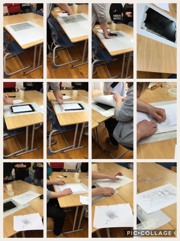
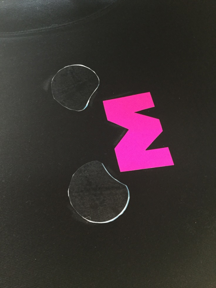
We then went on to make our own mono prints.

img_0818

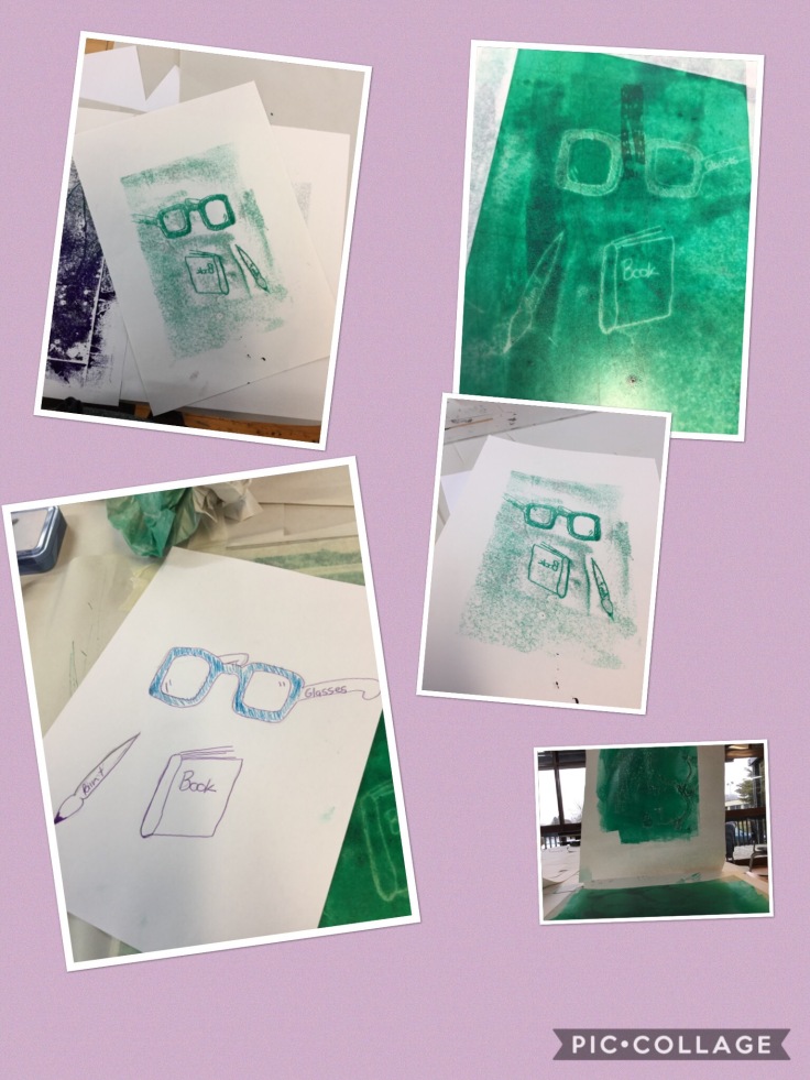
My first attempt I didn’t mirror the letter I used. I could of pushed or put more pressure in the corners of this first design.

img_0819

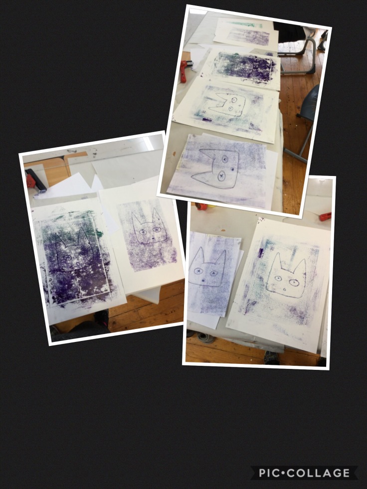
In my second print i changed my design and didn’t use borers I think it made the design very messy.
The thrid print had too much ink! The design came through but was also very messy.
My last mono print I did I used straight edged corners and the pressure was equal. The ink was more equal distributed over the image.

I enjoy mono printing as it was something I’ve never done or even heard of before today. It was very messy but an enjoyable practical and hands on day.

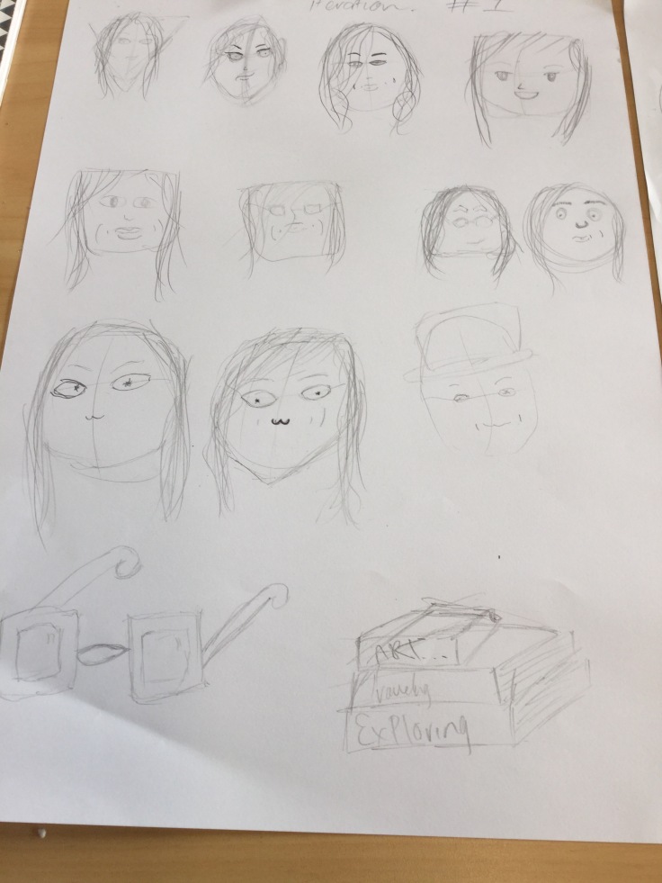
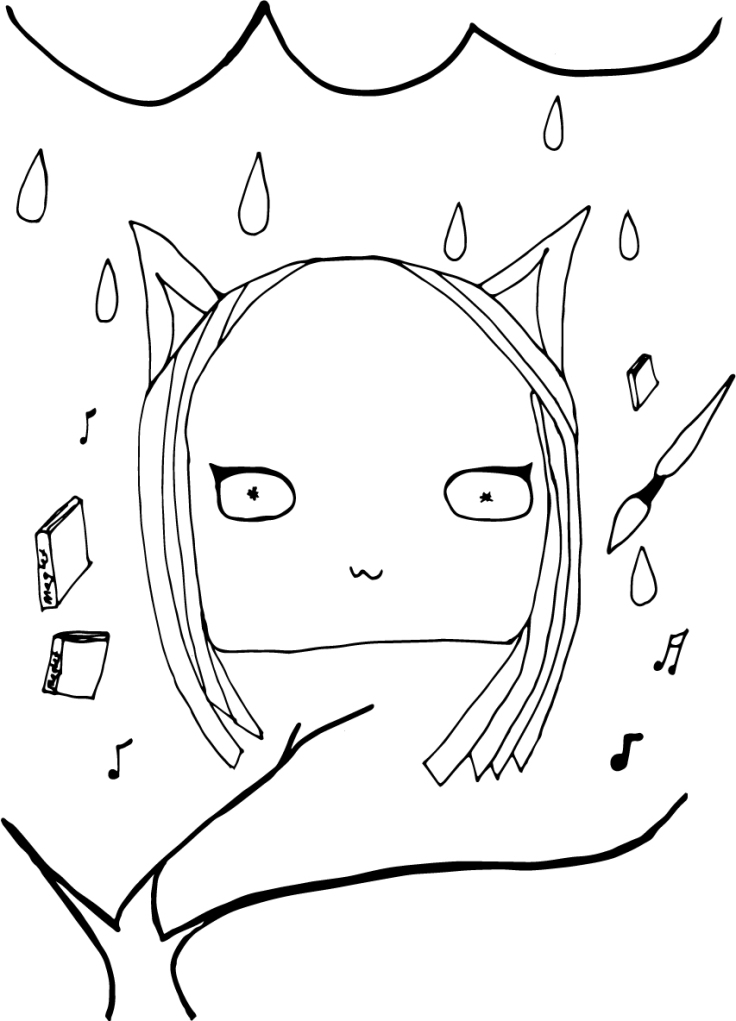
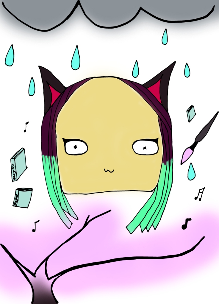
Today Denise run an art therapy workshop. The task was to draw what we think right at this moment.
My picture was about being unsure if I will pass or fail my degree.. in the corner it says a+ or NA.

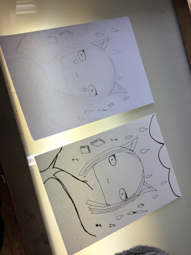
After that we created a tree that represents us. Mine is half full of cherry blossoms to show that I’m half Japanese. I have deep and many family roots. I have applies on my tree because I believe that I provide to those in need. I have the yin-yan sign on my tree because I believe that there is good in evil and evil in good.  I also have a heart for my love and waves because I love the beach, it’s where I grew up.

MANRO

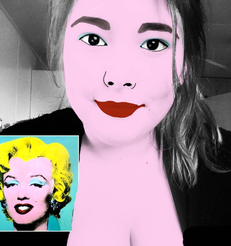
In the afternoon we looked at recreating a Andy Warhol’s type of image using Photoshop. this design was a lot of fun but I think I could forever continue to add and change a lot of little details.


Illustrative Self-Portrait Week Two

Today we looked at:

  • Illustrative (Story, related to pictorial)
  • Render (Finalising Designs)
  • Iterations (repetitive process)

We looked at a power point on illustrative artist. for example Clare Owen,

Today we were ask was to create 2 pages of iterations

img_0722

Iteration #1

Iterations #2 

We then went to work on completing 4 illustrative portraits.

They were:

  1. illustrative portrait
  2. illustrative portrait including our spirit animal
  3. illustrative portrait including possessions/meaningful items
  4. illustrative portrait that represents an element of your past/where you’re from.

Instead of Complete 4 different designs i tried to Create all 4 ideas into one final design.

img_0726
The image on the left is the first Sketch and Right is over layer traced image. 

I then turned into a digital drawing.

I scanned in my image and then I turn it into a vector in illustrator.

digtal image day one

Following the class I then used photoshop to colour my digital image.

digtal image day one.jpg

I would had done this image a lot different if I had the chance to recreate, I think time would of helped this design a lot.


Self Portrait Reflection Week one

Using the adobe draw app on my iPad. I drew a self portrait using lines and different colours. I created these different colours by using the eye dropper tool and the photo/selfie I took. This drawing was meant to respresent one of Van Gogh’s self portrait. He used a lot more smaller strokes and uses a more monochrome colour palette of brown/yellow. If I was to recreate this artwork again I would use more dots and smaller lines to my advantage is well as creating a background. Van Gogh’s self portrait is very busy compared to my own design.

Create a free website or blog at WordPress.com.

Up ↑